This interactive map is amazing. It is comprehensive, color-coded map of racial distribution across the United States. Blue dots: White; green dots: Black; red dots: Asian; orange dots: Latino; brown dots: all other races. Click on it and you can zoom in to any location in the country - down to individual neighborhoods - and see who lives where. It was created by Dustin Cable at University of Virginia's Weldon Cooper Center for Public Service.
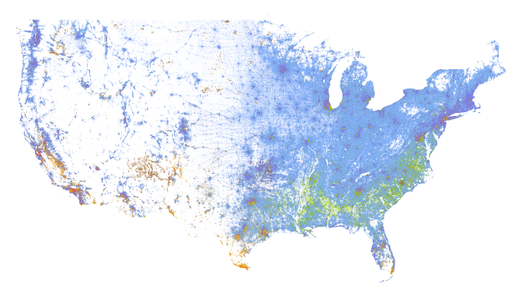
Click on Map
A quick look should give comfort to white people who are worried we are losing our dominant position in the United States. We pretty much have have the country covered. And a closer look at specific cities should give pause to those who say that we are living in any sort of post racial society. Our cities look a lot more like the Balkans then even a vaguely multicultural landscape. Some key cities:
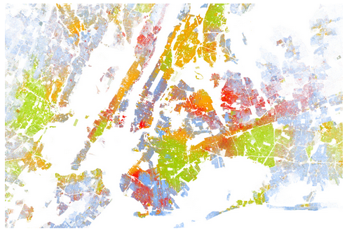
New York
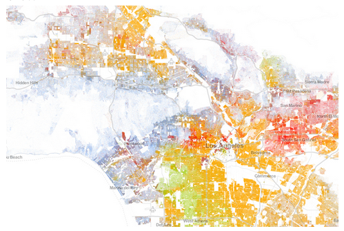
Los Angeles
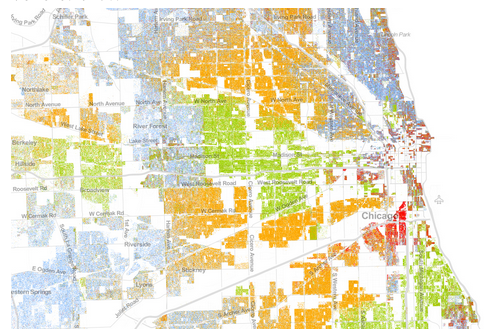
Chicago
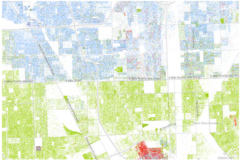
Detroit
Where I live
 RSS Feed